Review of Tufte’s Future of Data Analysis Presentation
I watched a recorded video presentation by Dr. Edward Tufte from 2016 titled “The Future of Data Analysis.” It was a very insightful look into the changing landscape of the field of data analysis and data visualization. He provided some key findings of what all of us need and should strive for in the future in this field. Here are some notes and findings I highlighted from this presentation that I found very insightful:
Most of us don’t think about this part of human history very much, but Gallileo, according to Dr. Tufte, was probably considered one of the greatest data thinking eyes to ever live. In his work of the Sidereus Nuncius, Gallileo illustrated the Pleiades cluster of stars in the sky that were visible, not with a telescope, but to the naked eye. Basically, it was a low-fidelity visualization of data points, the stars.
Probably one of the most eye-opening and incredible data visualization graphics he showed was a graph showing the measles epidemic from a few decades back. It was split in half with the number of cases shown on the left without an available vaccine and the number of cases left after the vaccine. It was awe-inspiring the comparison being shown because there were hardly any data points for measles cases on the right side of the graph after a vaccine was provided. It showed the importance and power of vaccination. Here’s the graph:
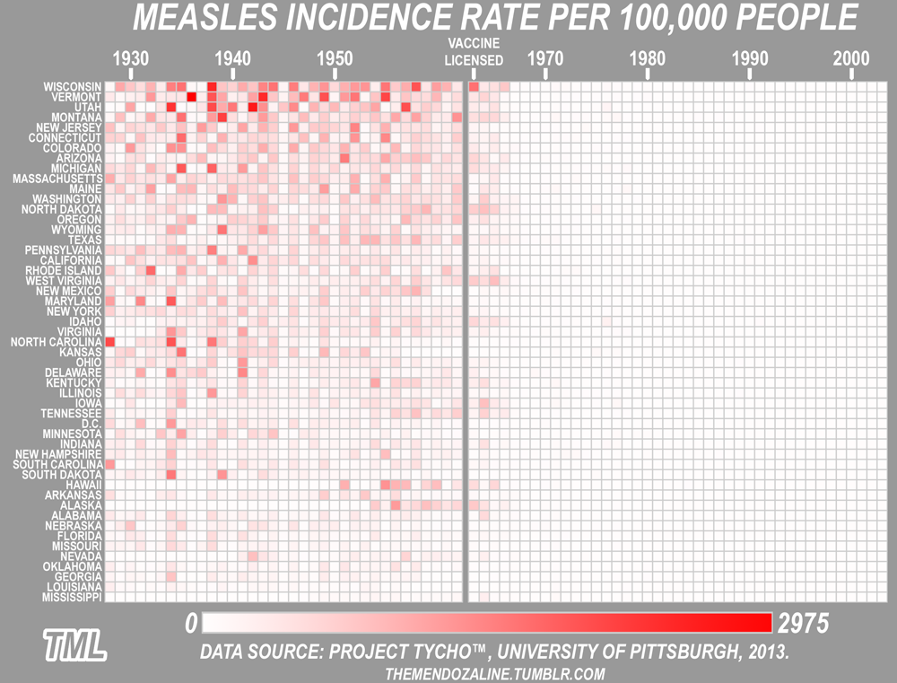
- The reason the measles incidence rate graphic was mind-blowing is it showed a “smart” comparison. Dr. Tufte points out that what we all need to strive for in the field of data visualization is not to make conclusions and findings, but to make smart comparisons by providing a better way of looking at the evidence that plain words and texts on paper are not able to do.
The only way to see big data is to see it. This ability in being able to see data has been greatly assisted by technological advances in screen-display quality of monitors. To clarify his point, he showed a map of the Swiss Alps that was put together to be seen on a screen-display and the contents were very clear and detailed. It was very easy on the eyes.
The greatest benefit about having musical scores and music being visualized through interactive colors and shapes is that it helps people with no musical abilities to make sense of the music and understand it is by relating elements of the music being heard and seen with tangible, visual patterns.
Maps like Google Maps need to have light background colors in to for us to see the details and information laid out before us. It provides contrast.
Sometimes, it is best to capture everything in an instant replay video of a sports highlight or sequence of soccer plays, for example, on a one-page display in stop-action. It is a good way for one to learn and analyze another team’s performance, and strengths and weaknesses, if you are the athlete.
It is important to have an open mind, but not an empty head when analyzing data. This is because we want to avoid bias. If we do not, then the problem of fake publications, false-positives, and false-alarms will be an issue in our findings and conclusions of the data. The responsibility of data analytics is to get it right. This is why, for example, when analyzing human behavior that it is harder to replicate replication studies on human behavior and, thus, makes the analysis of human behavior harder than rocket science.
After sharing all these invaluable pieces of insight, Dr. Tufte concluded his presentation by pointing out that you can have you own point of view, but not your own facts. He points out that we need to muck around in our data to discover what we did not know. He advises us to take a look a look at the “Quartz Guide to Bad Data” and not fall victim to biases such as “survival bias” where as a famous saying goes “Castles are not all made of stone. They are also made of wood.”